.svg) marketing@innominds.com
marketing@innominds.com.svg)
.svg)
.svg)
.svg)
.svg)
Wouldn’t it be a lot better to use custom fonts as a resource in place of images for small icons?
Makes more sense, right?
In Android applications, we generally end up using labels or textviews to display the content. For these, we also apply a font family because if we don’t, it will automatically pick the default font family. Since system default fonts can exhibit a different look on every platform, like Android, iOS, and Windows, even when using the same font family, we need to use custom fonts that allow a unified look on every platform.
Let’s explore how you can use the custom font as a resource.
Custom Font as Resource
When we use custom fonts as a resource for small and single-colored icons, we are able to reduce resource utilization.
For example, almost every application has a tab bar or menu. This tab bar or menu has icons for each item, and every icon has two states:
- The normal state (unselected)
- The selected state
If we need to display these icons in form of their states, we need to use the assets in the appropriate format for iOS, Android, and Windows.
iOS will have 3 (3*2= 6 images for each item) containing different resolution sets. Android and Windows will have 5 (5*2= 10 images for each item) containing different resolution sets.
What if we say we can reduce this?
Using a single TTF (True Type Font) or OTF (Open Type Font) we can reduce the use of so many images. These icons are stretchable and scalable with no resolution problem. We can easily use color at compile time or run time for selected/unselected icons according to the state as required.
How we can Use Custom Fonts as Resource?
We can apply these fonts as Label or Button, which means increasing or decreasing the image size by adjusting font size.
- Create a sample project.
- Add the Custom Font file to each platform level project with the respective Resources/Assets folder.
- For Android, place the font file under the “Assets” folder.
- Right-click on the file and make Build Action as “AndroidAsset”.
- For iOS, add the font file under the “Resources” folder.
- Right-click on the file and make Build Action as “BundleResource”. Remember that icons may not be shown if the build action is anything other than “BundleResource”.
- Open iOS project and then “info.plist”.
- Add an array attribute (fonts provided by the application) and add all the custom font names along with the location.
- Add a resource with the key under App.xaml file to access it in the application. But this value is different for each platform.
- For Android, mention the font file name and font name followed by the symbol of ‘#’.
- For iOS, the font name is sufficient.
	<Application.Resources>
         <OnPlatform x:TypeArguments="x:String"
                     x:Key="IconFont">
            <On Platform="Android"
                Value="Font_Awesome_Regular.otf#Font Awesome 5 Free Regular" />
            <On Platform="iOS"
                Value="Font Awesome 5 Free" />
         </OnPlatform>
    </Application.Resources>
Following the above steps, create a static class that contains keys with unicodes, which are mapped to each icon in the font file. To find out the icons that are mapped to the respective unicodes, we can open the font file using a tool or check online. In this example, we have used a few unicodes:
public static class IconConstants
{
public static string bulb = "\uf0eb";
public static string like = "\uf164";
public static string folder = "\uf07c";
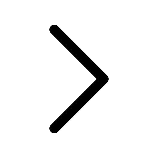
public static string right = "\uf058";
}
Now, create a ContentPage and import the namespace where unicodes are defined, and bind them with the Text Property:
<ContentPage xmlns="http://xamarin.com/schemas/2014/forms"
xmlns:x="http://schemas.microsoft.com/winfx/2009/xaml"
xmlns:d="http://xamarin.com/schemas/2014/forms/design"
xmlns:icons="clr-namespace:CustomFontsDemo"
Title="Iconic Fonts"
xmlns:mc="http://schemas.openxmlformats.org/markupcompatibility/2006"
mc:Ignorable="d" x:Class="CustomFontsDemo.MainPage">
<ContentPage.Resources>
<Style x:Key="labelStyle" TargetType="Label">
<Setter Property="VerticalOptions" Value="Center" />
<Setter Property="Margin" Value="20,50,0,0" />
</Style>
</ContentPage.Resources>
<StackLayout HorizontalOptions="Center" Margin="20">
<StackLayout Orientation="Horizontal">
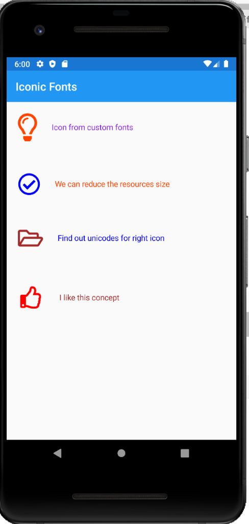
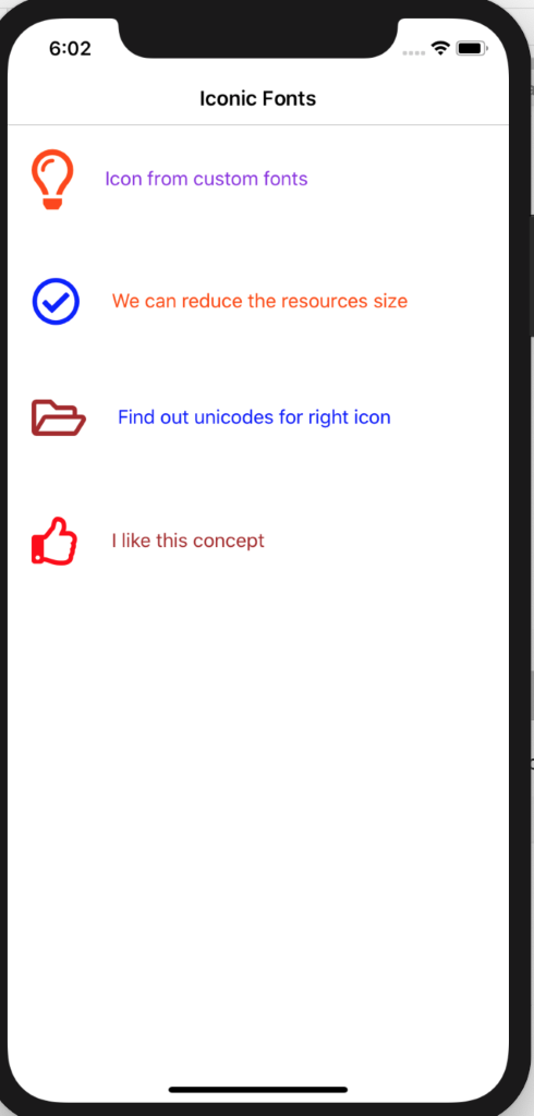
<Label Text="{x:Static icons:IconConstants.bulb}"
TextColor="OrangeRed"
FontSize="50"
FontFamily="{StaticResource IconFont}" />
<Label Margin="20,0,0,0"
Style="{StaticResource labelStyle}"
Text="Icon from custom fonts"
TextColor="BlueViolet" />
</StackLayout>
<StackLayout Orientation="Horizontal">
<Label Margin="0,50,0,0"
Text="{x:Static icons:IconConstants.right}"
TextColor="Blue"
FontSize="40"
FontFamily="{StaticResource IconFont}" />
<Label Style="{StaticResource labelStyle}"
Text="We can reduce the resources size"
TextColor="OrangeRed" />
</StackLayout>
<StackLayout Orientation="Horizontal">
<Label Margin="0,50,0,0"
Text="{x:Static icons:IconConstants.folder}"
TextColor="Brown"
FontSize="40"
FontFamily="{StaticResource IconFont}" />
<Label Style="{StaticResource labelStyle}"
Text="Find out unicodes for right icon"
TextColor="Blue" />
</StackLayout>
<StackLayout Orientation="Horizontal">
<Button Text="{x:Static icons:IconConstants.like}"
HorizontalOptions="Start"
Margin="0,50,0,0"
BackgroundColor="Transparent"
TextColor="Red"
FontSize="40"
FontFamily="{StaticResource IconFont}" />
<Label Style="{StaticResource labelStyle}"
Text="I like this concept"
TextColor="Brown" />
</StackLayout>
</StackLayout>
</ContentPage>
Limitations of this Method
We can apply any single color for these images, not supported for the multi-color. This means that you can only utilize this method at places where we are using one color.
Summary
You may be wondering why you should try custom fonts as a resource, isn’t it? Here are some reasons:
- It reduces the number of resources
- It supports single color
- It is scalable; no stretch or pixel issues
- It supports Label and Button controls
Now that you know this is an important tool, run the application and check the below output for reference.


